Thrive Design, Tips & Trends
Getting to know our interior colour schemes
Undertaking a new house and land build is like jumping on one big rollercoaster of emotions and experiences. You’ll be learning a whole host of new things along the way and at some points you’re bound to feel challenged - but above all, a new home build should be FUN. After all your finances are sorted and things are well and truly underway, one part to look forward to is customising your home. At Thrive our customisation options include home design (of course), facade design (very important - creates a first impression of your home) and lastly, the colour scheme. It’s important to give plenty of thought to your colour scheme, as you’ll find this will dramatically influence the overall feel of your home both inside and out as well as your interior decoration plans. Read on to learn more about three of our faves.
For the colour enthusiast
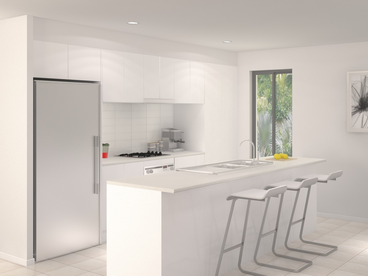
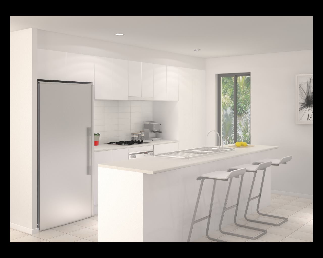
Aura colour scheme
This might sound a bit strange at first, but if you’re big on colour it’s always better to choose a plain, predominantly white or off-white colour scheme for your home. Why? So you can fill every space with colour! Furniture, artwork, accessories, the works - go wild! If your walls are too textural or tonal, it’s going to be harder to use colour in your furnishings as things will start clashing. If you’re a colourful character, we’d be recommending our 'Aura' scheme. Fresh, crisp and classic, this white-based palette allows you to do pretty much anything with your furnishings. Plus, the white works to lift and brighten the home. If you were determined to get some colourful paint on your wall, we can oblige. Our available upgrades include a feature wall to the room of your choice.
For the monochrome-mad
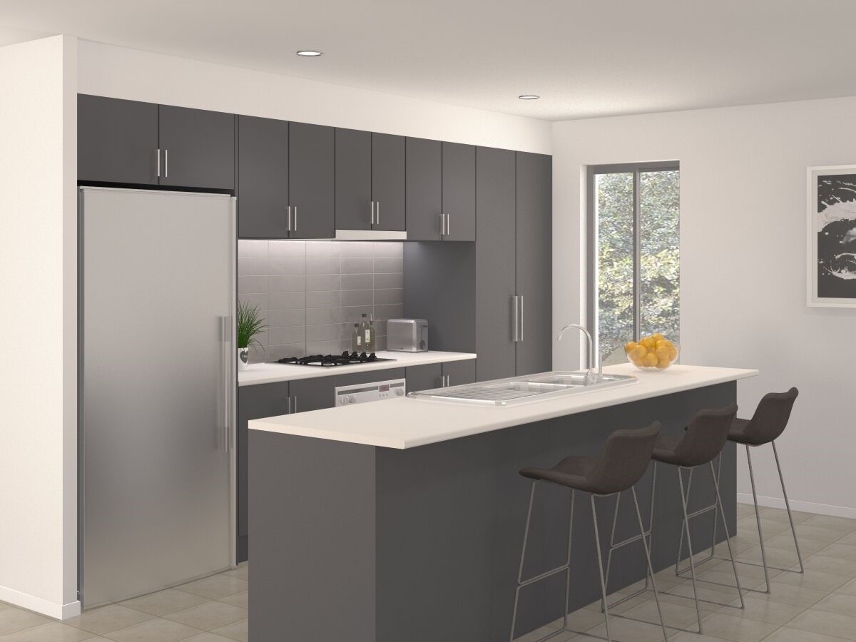
Ivy colour scheme
Love a cool mix of monochrome? You’re not alone. With a palette of graphite grey and glossy white, our ‘Ivy’ colour scheme creates an on-trend, high contrast environment with an additional mid-tone tile to introduce warmth. Our homes, with big windows in almost every room, up that warmth factor by making the most of natural light wherever possible. This works well with a darker colour scheme, preventing that ‘enclosed’ feeling. The palette on its own creates a moody, interesting vibe even with nothing else in the room, meaning you don’t need to go over the top on your furnishings. So, if your favourite colours are black and white (yes, they’re both technically colours) and your style is more minimalist than maximalist, this is the scheme for you.
Scandi style
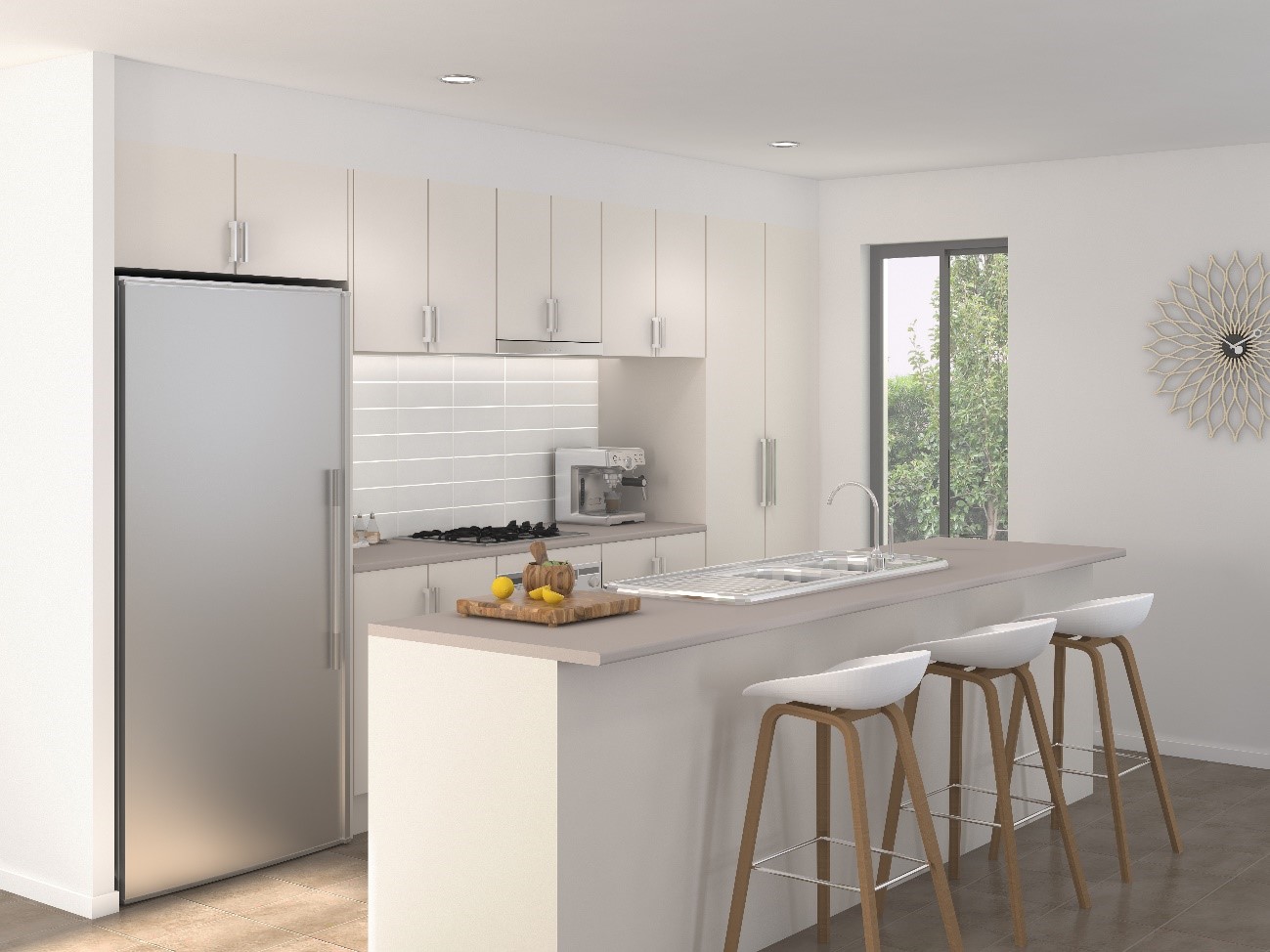
Akoya colour scheme
Scandinavian design is hugely popular in Australia, and with its soft tones, gorgeous timbers and simple, clean aesthetic it’s not hard to see why. Drawing inspiration from Scandi style, we created our ‘Akoya’ colour scheme. Akoya’s light and natural tones create a warm, inviting atmosphere that perfectly complements light timbers and natural finishes, while remaining neutral enough to support splashes of colour. This scheme also works really well in coastal-inspired homes. We can just see the Akoya home as a haven of off-white furniture complemented with thick, woven rugs and coastal accessories.
We’ve got many more colour schemes on offer at Thrive, as well as different schemes for your exterior facade. Come in and have a chat to us, we’ll help you find your favourite! Leave your details here and our Sales Experts will get in touch to arrange your free, one on one consultation.


